New My Space horizontal scroll layout with Jquery
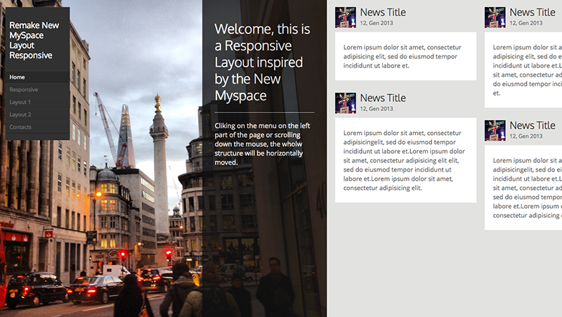
Last week the new My Space has been launched. The renovated social layout is actually very cool. The web site is innovative from different points of view, and, nowadays, it could be considered far away from any other social network (first of all Facebook) for it’s managment of integrated music and the catchy navigation system.
I could not wait, so i tried to build the new structure of the website up.
Differently from the real My Space, this one is able to adapt itself to every mobile dispositive (tablet and smartphones), thanks to the Responsive structure.
In the structure we can find three different kind of pages:
Cover
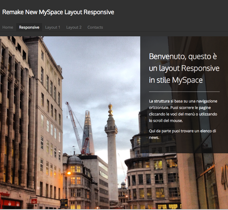
This is the first page of the layout. The cover picture is changed in height and the welcoming box is on the top of the right side of the page.
News
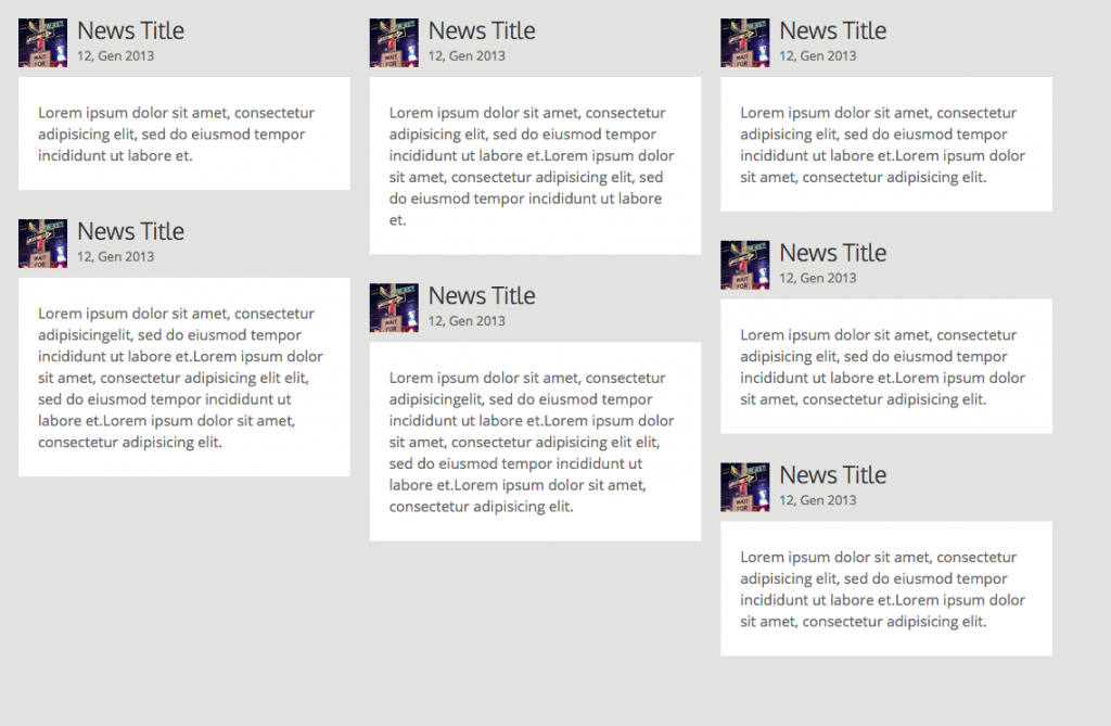
Always on the right side of the cover picture, it’s easy to find out news distribuited (thanks to jquery and isotope) in a Responsive grid, which optimizes the space giving the news in a temporal order.
Internal Pages
Cliking on the menu on the left part of the page or scrolling down the mouse, the whole structure will be horizontally moved. The internal pages could have images or not, as you prefer. The picture could also change in height,as for the cover photo.
Responsive

The Responsive organization could be reorganizated thanks to the device with whic it’s visualized. News on tablets are disposed into two columns, while news on smarthphones on the top, succeeding one another.
The downloading file is available down there, for any further question please write a comment… do you like the brand-new My Space?




Ciao … sai che stavo cercando proprio un lavoro tipo quello che hai fatto tu in quanto il nuovo layout di MySpace è veramente bello?!
Complimenti, ottimo lavoro!
Ho notato però che il layout di questo nuovo MySpace su Explorer non funziona bene (ovviamente, come al solito ci risiamo con Explorer). Sul 9, a me, non compare la barra di scorrimento orizzontale, idem su Explorer 8.
Ho notato che se navigo sul nuovo MySpace mi fa comparire una schermata “warning” nella quale mi invita a passare almeno ad Explorer 10!
Hai idea di coma faccia questo controllo e come farlo poi comparire in questo modo così fine ed elegante ?
Se hai una versione di Explorer 9 prova, anche questa piccola cosa è veramente cool!
Ciao
Ciao Gabriele, per fare un controllo su explorer di quel tipo puoi utilizzare questo codice:
[php]
<!– Prompt IE 6 and 7 users to install Chrome Frame: chromium.org/developers/how-tos/chrome-frame-getting-started –>
<!–[if lt IE 8]>
<p class="chromeframe alert alert-warning">Your browser is <em>ancient!</em> <a href="http://browsehappy.com/" rel="nofollow">Upgrade to a different browser</a> or <a href="http://www.google.com/chromeframe/?redirect=true" rel="nofollow">install Google Chrome Frame</a> to experience this site.</p>
<![endif]–>
[/php]
Ciao …
ok proverò …
Ciao e grazie